HTML comes with some default browser styling. For example in Chrome a standard <H1> is 2em with a margin of 0.67em at each end, and <H3> is 1.17em with a margin of 1em at either end.. These specifics aren't important. What you need to know is that
Tailwind removes all default stylingfrom paragraphs, headings, lists and more.
Tailwind was created with software development in mind, not web pages. You don't want to have to be removing margin styles from the browser as you build. And most of the time that's fine. With a website you set your headings, paragraphs, and lists in CSS. And with blocks of text, such as in a blog post, you might want slightly different styling.
So Tailwind has a.prose class where you can style your blog posts and chunks of text in the website exactly how you want.
For example, normally you might want your H1s and H2s to have a good margin-bottom. But in the blog, these H2 margins might be too big.
Editing Typography in the Theme
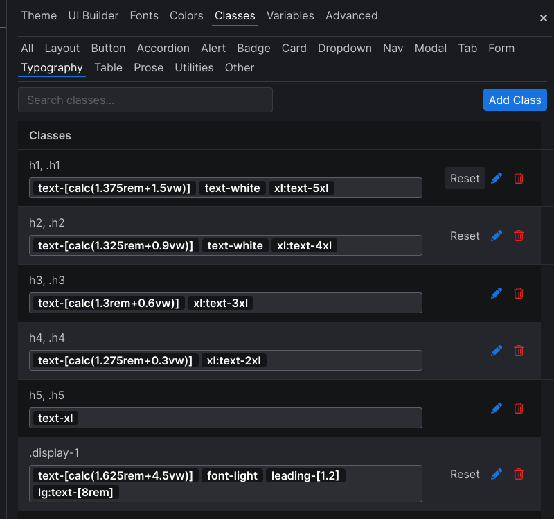
Here's a screenshot of the headings in the Theme of Versoflow. Notice there's an h1 and a.h1 which is the class. So a semantic <h1> will be styled the same as any text that is given an.h1 class. t

Editing Prose in the Theme
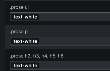
Here you see I've added classes for <ul> lists, <p> paragraphs, and <h2> to <h6> so that the text is white (remember the default background in Versoly is white, text is black).

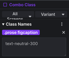
When you add a class, make sure you put the period before the class. Then add the HTML element you want to target. Here I'm changing the default style of the figcaption.
